Beverage · Packaging Design

A Toast for Non-Drinkers

Client
Shanhaiming Co., Ltd.
Role
Visual direction · Packaging design
Year
2023 — 2024
沛納特

On the surface, it's a bottle label. The real task is the moment a non-drinker lifts a glass at the dinner table. So the design starts from what people already know: a friendly, familiar look, with the name Pétnat Thé and the fruit in the bottle leading. The benefits, natural ingredients, no caffeine, no alcohol, stay in the background.

A closer lookPlates
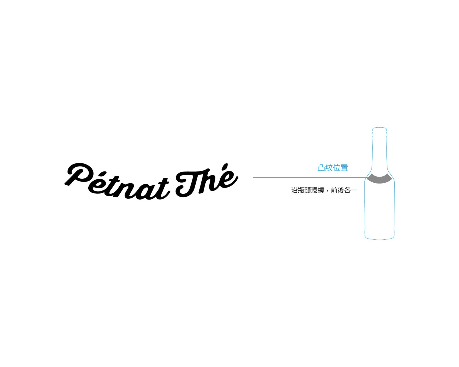
為瓶身浮雕微調成弧形的 Pétnat Thé 標準字,旁邊是瓶頸上浮雕位置的示意。
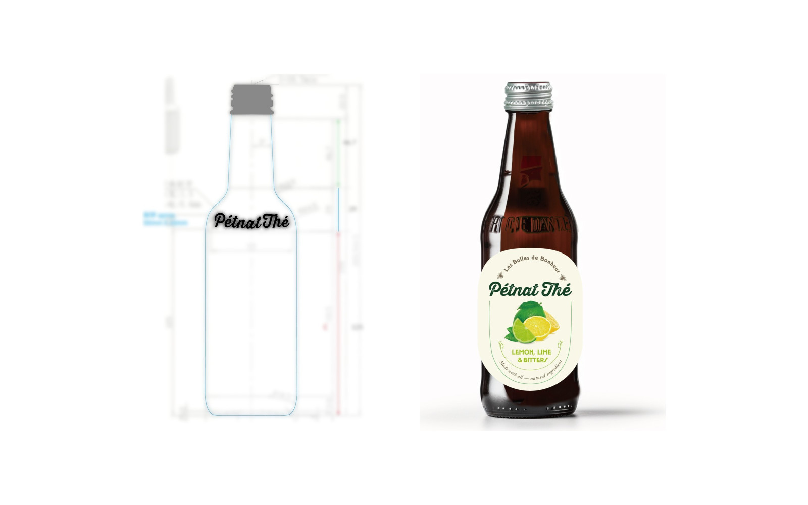
左邊是瓶身線稿,瓶肩上是 Pétnat Thé 浮雕;右邊是貼上標籤的琥珀色玻璃瓶。
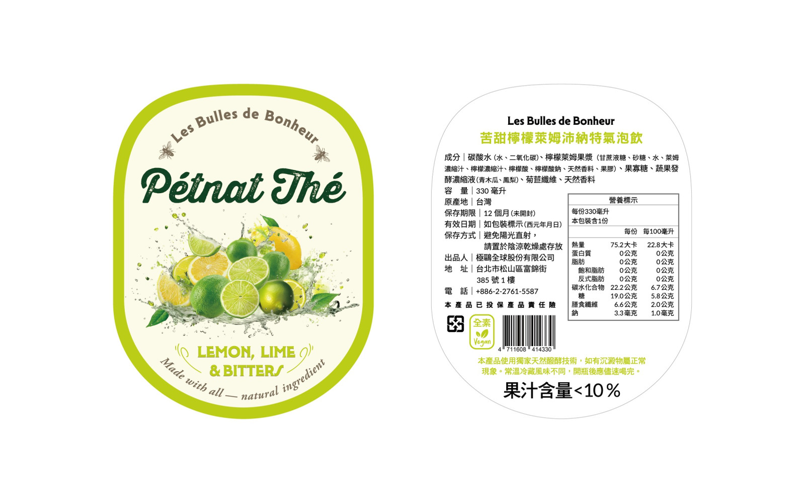
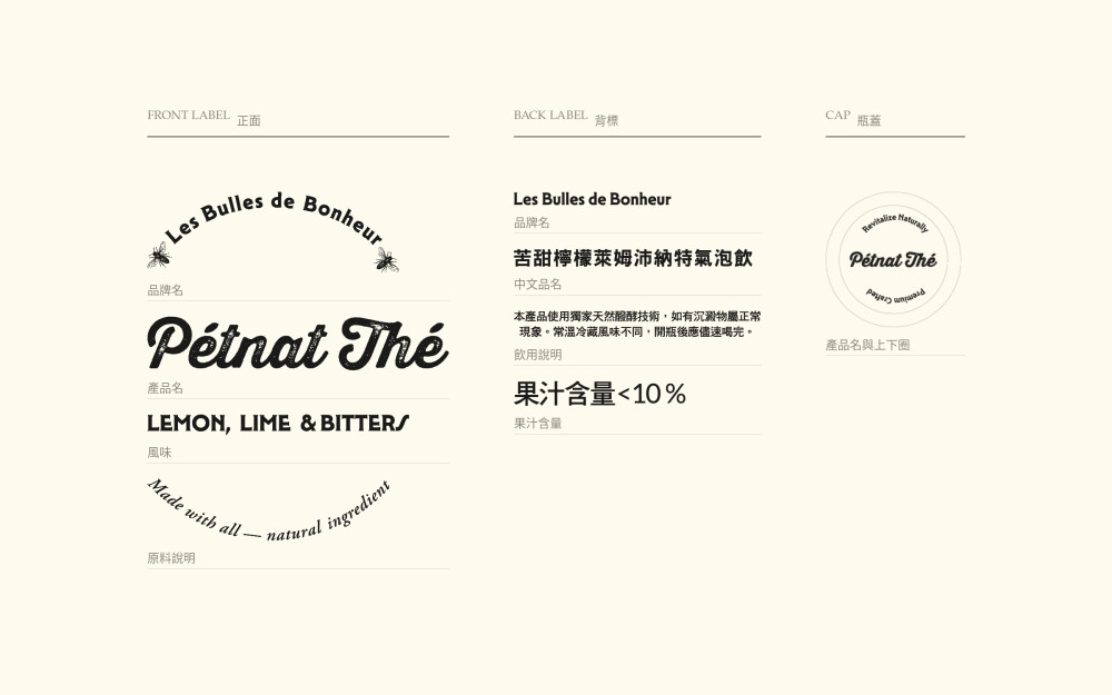
Lemon, Lime & Bitters 瓶標的正面與背標並排。正面是米色內底、黃綠色外框;背標有品名、成分、營養標示、條碼與全素標章。
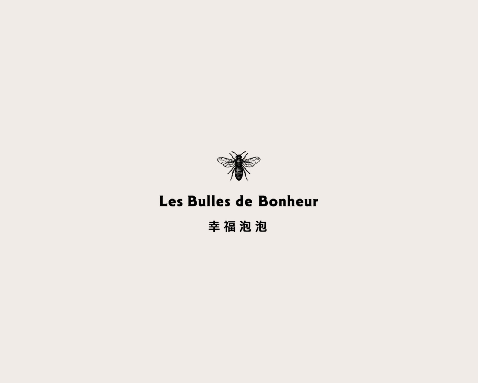
Les Bulles de Bonheur 幸福泡泡品牌標準字,上方是一隻蜜蜂圖案。
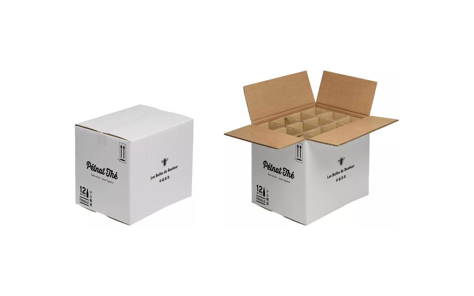
12 瓶裝紙箱,闔上與打開並排:側面印 Pétnat Thé 與 12 BOTTLES/FRAGILE/小心輕放,另一面是蜜蜂圖案與 Les Bulles de Bonheur 幸福泡泡;打開後是十二格隔板。
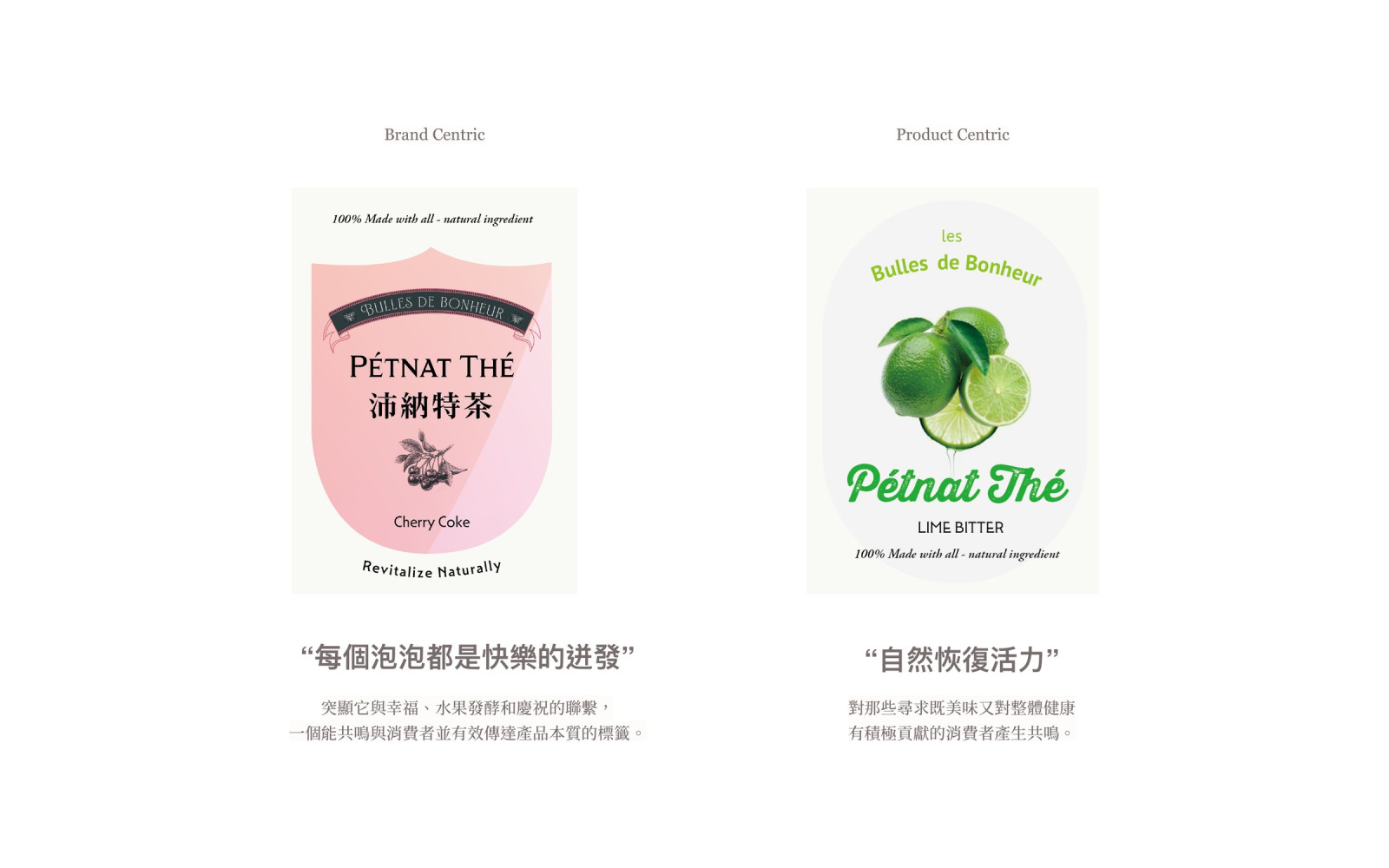
第一次提案的兩款瓶標:左邊粉紅盾形的 Brand Centric,右邊萊姆主圖的 Product Centric。
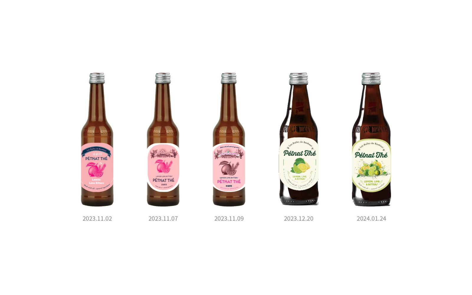
五支貼上不同版本瓶標的褐色玻璃瓶,由左到右依日期排列:三支粉紅色系標籤,接著是檸檬萊姆的米白標籤,最後是定稿的萊姆綠框標籤。